How to Create and Publish Nuxt Component Library
Have you ever come across a situation when you needed the same component in more than one project? One of the possible ways is to create a reusable component library so you can use these components at multiple places easily.
Nuxt-blog-kit is a component library that includes reusable blog components like Blog Lists, Details, and Author’s blog. You can easily use them by providing your blog data. You can visit it for a demo.
Nuxt-module is very helpful when creating any type of library in Nuxt. With the power of the Nuxt modules and tailwind CSS, let’s dive into the guide to creating a Nuxt component library.
Sponsored
We are what we repeatedly do. Excellence, then, is not an act, but a habit. Try out Justly and start building your habits today!
Create Module
To create a Nuxt module, run the following command,
npx nuxi init -t module <library-name>This command will ask you some questions, answer them based on your preferences and you will have ready to run module. You can see the directory structure of the module is different from the Nuxt project.
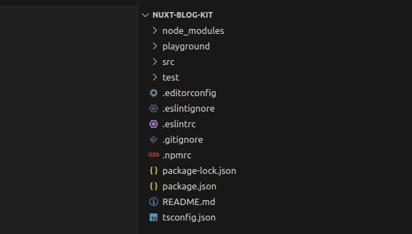
- src/runtime: It is the main directory and acts as src of your module. The underlying structure of
src/runtimeis similar to Nuxt-project. You can add stores, assets, components, and pages inside it. - src/module.ts: This is the main door of your module and acts as
nuxt.config.js. You can do model configuration inside it. - playground: This is used for demo purposes. You can run your code from src using this playground.
Module file
As we have seen, module.ts is the main file of our module. We need to understand its structure.
Below is the default module.ts file,
import { defineNuxtModule, addPlugin, createResolver } from '@nuxt/kit'

// Module options TypeScript interface definition
export interface ModuleOptions {}

export default defineNuxtModule<ModuleOptions>({
  meta: {
    name: 'my-module',
    configKey: 'myModule'
  },
  // Default configuration options of the Nuxt module
  defaults: {},
  setup (options, nuxt) {
    const resolver = createResolver(import.meta.url)

    // Do not add the extension since the `.ts` will be transpiled to `.mjs` after `npm run prepack`
    addPlugin(resolver.resolve('./runtime/plugin'))
  }
})
As we are building a component library, we need to add different configurations instead of addPlugin .
Nuxt-module has an option like addComponentsDir which will register a directory to be scanned for components and imported only when used.
Components (path: src/runtime/components)
Add the below code at a place of addPlugin,
await addComponentsDir({
      path: resolver.resolve("./runtime/components"), // path of components
      pathPrefix: false, // Prefix component name by its path.
      prefix: "", // Prefix all matched components.
      global: true, // Registers components to be globally available.
 });
You can explore more options at nuxt-schema.
Assets (path: src/runtime/assets)
Assets can be images, css/JS, or fonts. You can add them at src/runtime/assets.
Nuxt uses nitro as a server engine. You can configure public assets with nitro for better optimization in your module like the below,
nuxt.hook("nitro:config", async (nitroConfig) => {
      // if not already available, intialize as empty array
      nitroConfig.publicAssets ||= [];
      nitroConfig.publicAssets.push({
        dir: resolver.resolve("./runtime/assets"),  // path of assets
        maxAge: 60 * 60 * 24 * 365, // cache assets for 1 year
      });
 });
The basic setup is done, let’s configure tailwind css.
Tailwind CSS
You can configure tailwind CSS the same as any nuxt project. Install the @nuxt/tailwindcss module and configure it in your module.
Important !!!
As we are configuring modules in the nuxt.config.js file, the same way Nuxt-module provides options to configure modules and other options in the module.ts file.
Add module
@nuxt/tailwindcss is a module and we need to configure it in our module. Here is the code of module.ts,
nuxt.options.modules.push(
  "@nuxtjs/tailwindcss",
);
You can add multiple modules like @pinia/nuxt or nuxt-icon.
Add css
Generating output.css instead of postcss will be a better choice for external CSS.
You can use the below command to generate output.css,
tailwindcss -i src/runtime/assets/css/style.css -o ./dist/output.css --minifyWe need to push this CSS to module options to make available it to the dependent projects.
nuxt.options.css.push(resolver.resolve("./output.css"));Note: Reason for using ./output.cssinstead of ./dist/output.css is, that when a dependent project uses our module, the default path of this will be ./dist .
Dependency installation
It is possible that every dependent project does not use Tailwind CSS. It is worth installing the module with the build so it will be available for non-tailwind projects also.
Nuxt-module has an installModule option for this requirement. You can install as many as required modules using this option.
await installModule("@nuxtjs/tailwindcss", {
      configPath: resolver.resolve("./runtime/tailwind.config.js"),
});
Components
Head into the main part of our module, components !!
Inside src/runtime, create components directory. You can simply create nuxt-components or use a storybook or other options for creating components.
Below is a sample component for blog content,
<template>
  <div
    class="text-black-core/[0.80]"
    v-html="content"
  />
</template>

<script setup>
const props = defineProps({
  content: {
    type: Object,
    required: true,
  },
});
</script>

<style>
code {
  user-select: text;
}
</style>
For more detailed components, Review available blog components and their guideline.
Run and Review components
Now, this is the time to explore playground directory for running and reviewing components.
Playground’s directory structure is the same as a simple nuxt-project, which includes nuxt.config file.
You can see your module inside it as below,
// nuxt.config.ts

export default defineNuxtConfig({
  modules: ['../src/module'],
  myModule: {},
  devtools: { enabled: true }
})
Add your component inside app.vue for testing as below,
<!-- app.vue -->

<template>
  <div>
     <BlogContent :content="your-html-content" />
  </div>
</template>

<script setup>
</script>
Run playground
For running the playground, you need to build your module and tailwind CSS.
Build css and generate output.css for playground,
tailwindcss -i src/runtime/assets/css/style.css -o ./src/output.css --minifyoutput.css should be in src for the playground, as it is using src/module.ts not dist .
Then prepare build for playground using,
npm run dev:prepareRun npm run dev , and you will see your component at http://localhost:3000 .
Make necessary changes in your component and make it ready to publish.
Publishing the library on npm
This is the time to showcase your innovation!!
Create your account on npm.js and follow the below steps for publishing the library on npm.
- Do
npm loginfrom CLI. Add username and password and you will be successfully logged in. - Build module and css for production,
// build module
npm run dev:prepare

// build css
tailwindcss -i src/runtime/assets/css/style.css -o ./dist/output.css --minify- Specify the library version in package.json.
- Publish module using
npm publish. You can add scope(private or public) for your module.
Test npm before publish
It's obvious to test your creation before it goes live. NPM also provides this facility using the link command.
After building your module and css, you can create a local npm package for your module. Inside your module run,
npm linkThen in your dependent project, run
npm link <your-module>Add your module inside nuxt.config’s modules options like below,
modules: [
    "@canopassoftware/nuxt-blog-kit",
    ...
],
Voila!! Components from your module are available globally inside your project. If everything works fine, publish it and make it available to others.
Conclusion
Creating and publishing a Nuxt component library opens up a world of possibilities for both developers and users. Throughout this article, we’ve explored the essential steps to create and publish a Nuxt component library, from setting up a Nuxt project to structuring and organizing components to publishing the library for widespread use.
That’s it for today. If you have any questions or suggestions, please reach out to us.
Keep exploring and innovating!!
Similar useful articles


Whether you need...
- *High-performing mobile apps
- *Bulletproof cloud solutions
- *Custom solutions for your business.
